Llamas, Snoop Dog and Barbados: Getting banking ads right
Banking has radically changed over the past decade. With new advancements in technology, you can now access, pay, and transfer your finances from anywhere. Many of the traditional banks quickly leveraged these new changes to help their customers, but many were left behind (and still are) when it comes to the new era of online banking.
Although many of the traditional players stepped up, a number of start-ups emerged and saw that although these banks were adopting new tech, many of the old practices were still present in their workings. New ‘challenger banks’ emerged like Monzo and Revolut, aimed at providing a new revolutionised experience to help customers keep track of their finances in a quicker, easier way than was previously possible.
These ‘new’ banks came out with edgy, cool advertising campaigns which were very different from the advertising that many were used to seeing from traditional banks, and after seeing their success a number of traditional banks followed suit.
We’ve run some of the most bizarre banking ads we’ve come across through our emotional testing tool, UnrulyEQ, to find out how well they performed and whether these types of ads really work in reaching consumers.
Snoop Dog takes centre stage
Klarna is a Swedish bank that provides online financial services including payment solutions for online storefronts, direct payments, and post-purchase payments. This year it was announced that Snoop Dog (yes, THE Snoop Dog), had become a shareholder in the company, and a new marketing campaign was launched, fronted by the rapper.
Well, what can we say! The ad certainly makes a splash and received mixed opinions in Sweden. Our emotional data showed high levels of confusion amongst viewers (30% vs a norm of 16%), this is likely due to the bizarre scenes throughout the ad, and that it’s not clear that the ad is for Klarna until the very end when the logo and tagline appear.
The top three emotions that this ad evoked were inspiration, warmth and happiness, helping viewers develop a positive view of the brand. This strange ad featuring a well-known celebrity will no doubt ensure that viewers remember the ad. This along with the logo appearing at the end will have contributed to the high level (73%) of brand recall amongst viewers.
Although our analysis showed that many viewers were confused by this ad, overall, the ad succeeded in building brand recall and leaving viewers feeling positive about the brand, however strong feelings of confusion indicate that people didn’t understand what the ad had to do with the brand. High levels of confusion can minimise positive responses because if viewers don’t understand what’s going on, they are less likely to emotionally engage with the ad.
Here’s a llama, there’s a llama…
Let’s take a look at another bizarre banking ad, this time from the US banking giant Bank of America entitled the Llama…(just when you thought it couldn’t get any stranger).
Again, similar to Klarna’s ad (and unsurprisingly) this ad scored extremely high for confusion (34% vs. 11% norm). This is likely down to the ad being pretty strange, and again, only revealing the brand at the end of the commercial.
This ad scored considerably below-norm across all key metrics. Most noticeably; 17% vs. 39% norm for purchase intent, 22% vs. 39% for finding out more and 13% vs. 39% for favourability. These stats indicate that the ad did not succeed in driving potential new customers or building strong brand recall. Looking deeper into brand recall 56% of viewers could not remember or tell who the brand was after viewing the ad, and 12% of viewers did not think the ad mentioned a brand.
Travelling with Monzo
Monzo is a digital-only bank which is based in the UK and was founded just 4 years ago. Since its inception, it’s grown exponentially and has sought to shake up the banking industry by offering a straight forward online-only service.
Unlike the other two ads, it’s clear from the outset that this is a banking ad, and the ad highlights features that are available with if you hold a Monzo account. With this ad, Monzo was able to keep it fun and fresh whilst conveying its message effectively. As a result, it scored highly for knowledge (17% vs a norm of 8%) and scored above the norm for all key metrics. What’s more 74% of viewers said they remembered the brand after watching the ad.
Interestingly the ad scored above average for contempt, this is likely due to viewers thinking that the features that Monzo offer are not that different from what their bank offers, and as a result don’t see why they would need to sign up with them.
Which emotions come out on top?
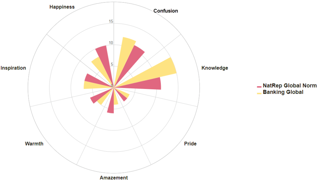
We took a look at all the banking ads we’ve ever tested across the globe to see what emotions are most commonly evoked by banking brands.

We found that banking ads typical underperform for intense emotional response compared to the Global Norm which is likely because of the increased levels of knowledge. Many banking ads use a voice over and a lot of on-screen text. If viewers are taking in new information it can inhibit their ability to connect with the video. The amount of information conveyed in these videos can, shown by the above-norm levels of confusion, be overwhelming.
However, going the other way and not conveying hardly any information, as we saw in the Klarna ad, can be just as confusing. Giving less information and focusing more on telling a story is a primary way to stand out amongst other banking ads. As we saw, Monzo did this well in their travel ad. There’s nothing wrong with banks wanting to stand out and make a splash by being a bit different, but they need to ensure that their story doesn’t get lost amongst all the glitz and glam (or llamas and dressing gowns).
